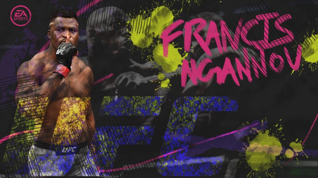
In a world where user experience reigns supreme, crafting intuitive and visually appealing interfaces is paramount. This case study delves into the design journey to elevate the user interface (UI) of EA Sports UFC, a popular mixed martial arts video game franchise developed by Electronic Arts.
Championing the essence of the sport while prioritizing usability and engagement, this case study explores the iterative process of refining the UI to cater to both seasoned gamers and newcomers alike. From enhancing navigation to optimizing visual hierarchy, each design decision is meticulously examined to elucidate its impact on user experience.
EA Sports sets the standard in gaming design with its impeccable attention to detail in UI and gameplay. From intuitive interfaces to lifelike graphics, every element is meticulously crafted, delivering immersive experiences that captivate players worldwide.
Color Theory
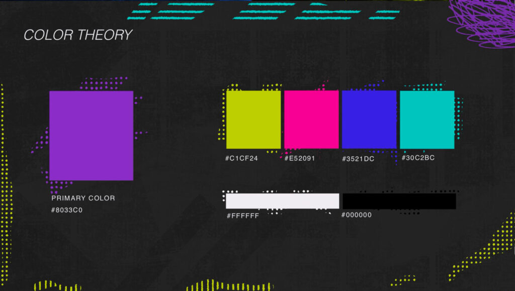
Vibrant shades were chosen to align with the high-energy nature of mixed martial arts (MMA) and to enhance the overall mood of the game. Vibrant colors evoke excitement and intensity, reflecting the adrenaline-fueled atmosphere of MMA matches.
This choice was made to engage players, improve the visibility of key UI elements, reinforce brand identity, enhance aesthetic appeal, and ensure accessibility for all players. Ultimately, the use of vibrant shades contributes to a dynamic and immersive gaming experience in EA UFC
Font Selection
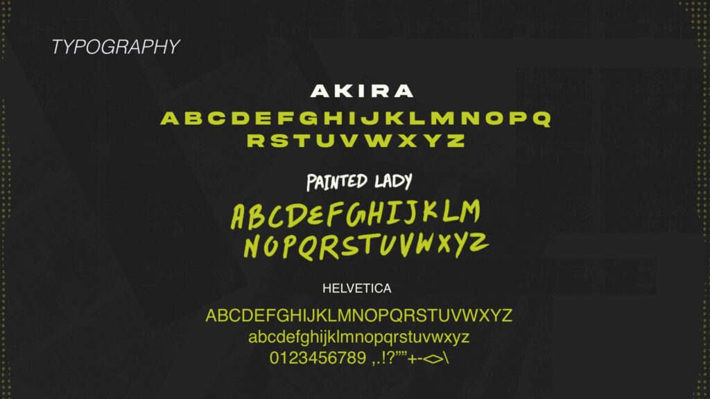
Our font selection aimed to evoke specific emotions and enhance the overall aesthetic of the interface.
We opted for Akira, a bold and expressive typeface, to instill a sense of competitiveness, amplifying the player’s engagement and intensity during gameplay.
To add a rugged and raw feel to the design, we integrated Painted Lady, a font renowned for its rough texture and gritty appearance. Lastly, for ensuring legibility and maintaining a clean presentation.
We relied on Helvetica for standard text elements, providing clarity amidst the bold visual elements of the UI.
This careful selection and combination of fonts contributed to a cohesive and impactful user experience tailored to the energetic atmosphere of EA UFC

Style Elements
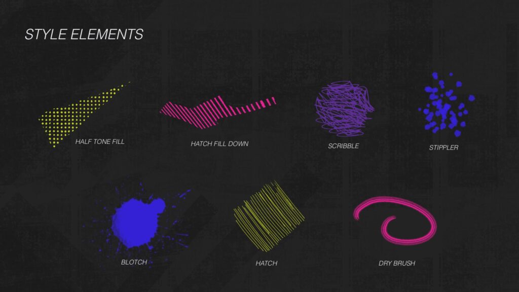
In crafting the visual elements of the game, I incorporated a multitude of textures into the backdrop and button designs to infuse them with expressiveness and boldness. These textures were carefully chosen to evoke an urban aesthetic, resonating with the raw and gritty nature of the game
This deliberate use of textures not only enhances the game’s visual appeal but also contributes to establishing a sense of authenticity, reinforcing the urban backdrop against which the competitive spirit of the game unfolds.
Ultimately, these textural elements work in concert to create an immersive experience that resonates with the visceral energy of EA UFC.


Dashboard
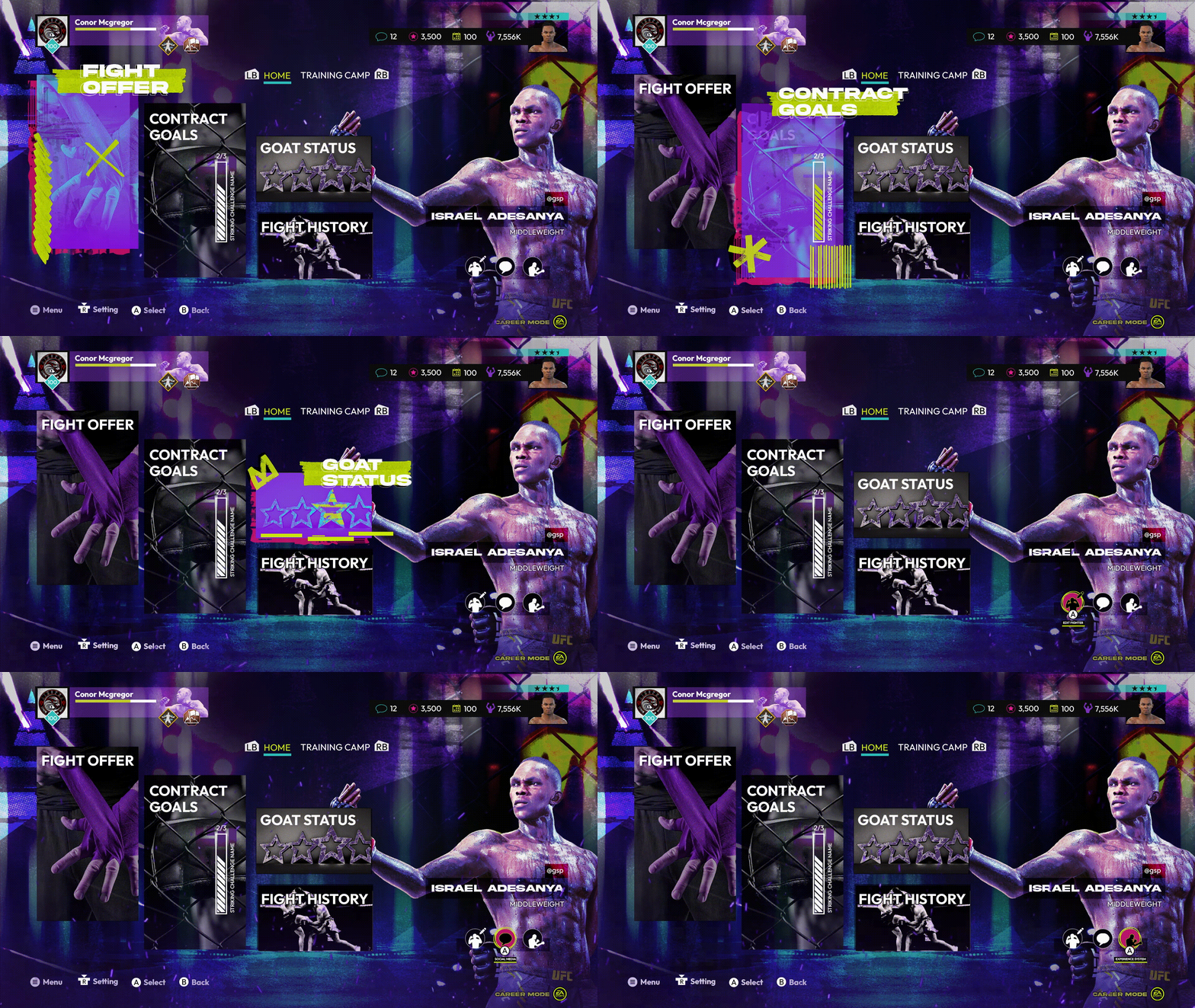
When the user hovers over selections, graphical elements within the interface dynamically expand in prominence, creating a visual emphasis on the chosen option.
This interactive design feature enhances user engagement by guiding their focus to the active elements, thus improving the overall usability and interactivity of the interface.

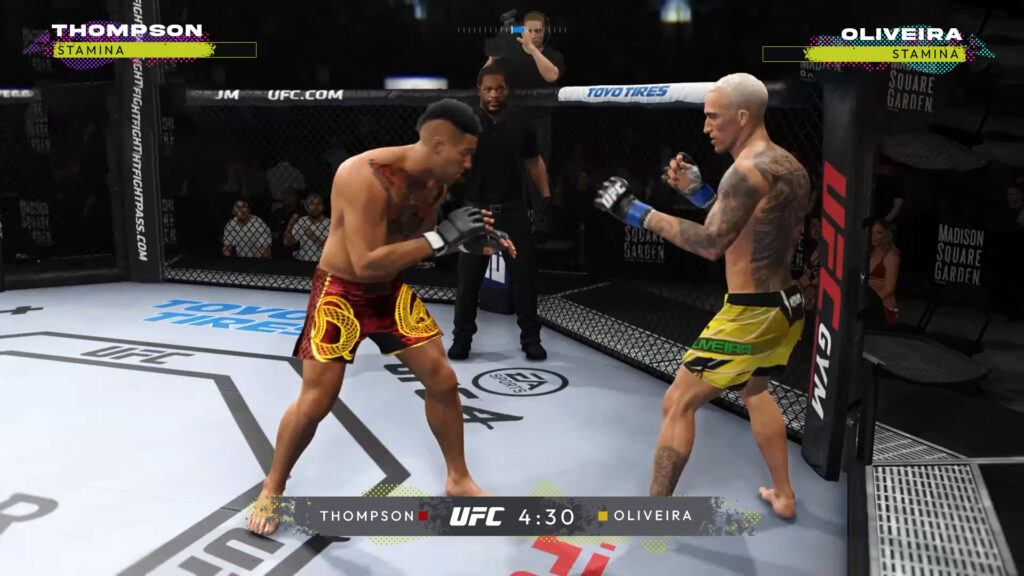
Consistency in the color palette and the incorporation of gritty textures persist in the gameplay, extending to elements such as the stamina bar and point table.



Game Backgrounds

