Role
UI/UX Designer
Skills
UX Research, Visual Design, Branding,
Prototyping, Illustration
Software
Figma, Adobe Illustrator, Adobe Photoshop
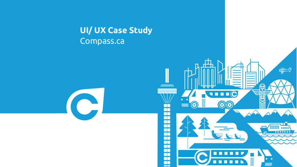
About Compass Card
I had the opportunity to redesign the website for the Compass Card, a smart card used for public transportation in the Greater Vancouver area. The goal of the redesign was to improve the user experience and make it easier for customers to access information about the card and manage their accounts.
Overview
In this project, we were given the freedom to choose any website for redesign, and my initial choice was the Compass.ca website. For those who may not be familiar, Compass.ca is the local transit website in British Columbia, where you can reload your card, check your usage history, and access information about different routes.
During my early days as an international student, I relied heavily on this website, using it almost every week to check my history, reload my card, and find information about routes. However, I noticed certain aspects of the site that hindered a smooth user experience and made it challenging to find specific information, such as instructions on how to reload the card. In some instances, I even had to seek assistance from a friend. Considering that compass.ca is often the first website newcomers to the city visit from any part of the world, it should provide a welcoming experience and offer insights into the localities.
Based on my research and observations, I have developed the following redesign proposal.
Problem Analysis
The original website was outdated and had a cluttered design that made it difficult for users to find the information they were looking for. I started the redesign process by conducting research on the target audience and their needs. This helped us to identify the most important information that needed to be featured on the website and prioritize it in the design. Here are some of the problems I found on the website.
- Cluttered homepage: The homepage of the website has a lot of information and visuals, which could be overwhelming for users and make it difficult for them to find what they need.
- Inconsistent design: The website has inconsistent design elements, such as varying font sizes and colors, which can make it difficult for users to navigate and understand the site.
- Confusing navigation: The navigation on the website could be confusing for users, as there are multiple menus and links that lead to similar information.
- Limited accessibility: The website could be more accessible, as there are no options for users to adjust the font size or color contrast, which could make it difficult for users with visual impairments to use the site.
- Lack of visual hierarchy: The website does not effectively use visual hierarchy to highlight important information, making it difficult for users to identify the most relevant content quickly.
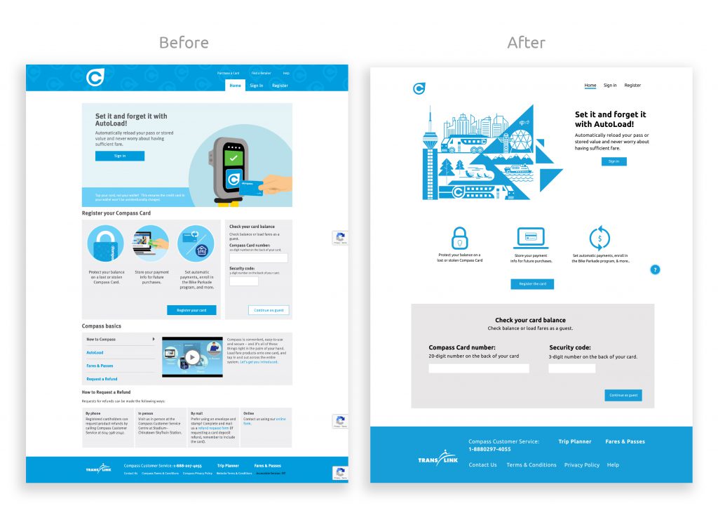
Problem
Compass.ca is a website often used by all the local people and especially new travelers in BC. The website should have something on the home page which Introduces newcomers to the City.
Solution
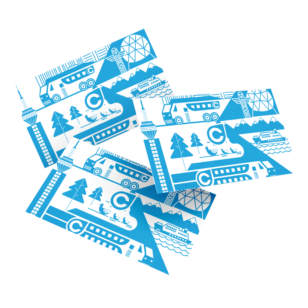
One of the ways to introduce the user to the city is by using illustrations. The graphic art shows the 3 ways of transport and all landmarks of the BC and natural beauty. Icons were minimalized and the current layout had many boxes and there was too much negative space on both sides.
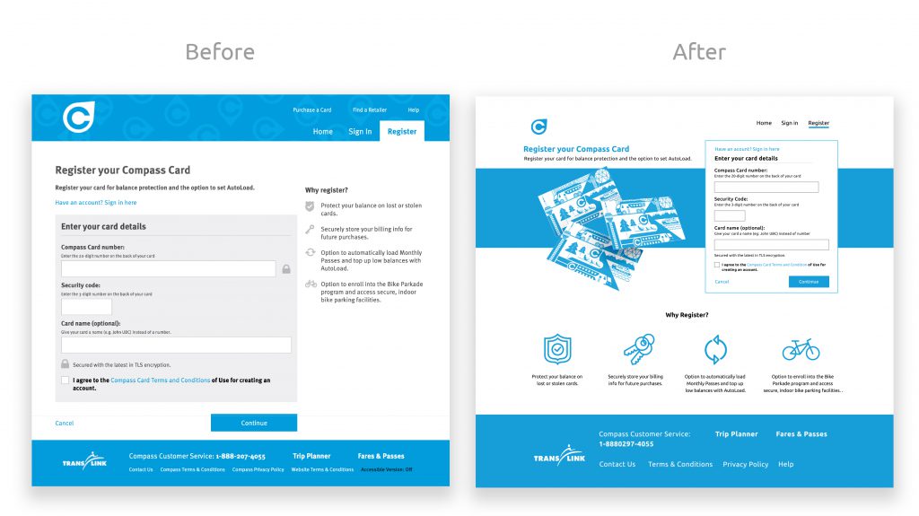
Problem
The current register page is very simple and unbalanced. Similar to the home page it has ample negative space on both sides.
Solution
As it is the register page of the compass card, idea was to have some graphic elements of the card and enhanced the icons to make it look visually pleasing.
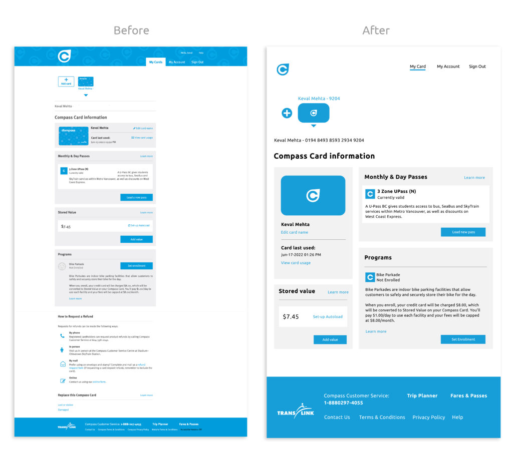
Problem
‘My card page’ is currently very lengthy and to know all the information user has to scroll numerous times. Also, the design of the card icon has extra details which are not suitable for icons.
Solution
Changed the grid view of the cards Instead of placing them in a flex way which currently acquires adequate space. Also, the new design equally balances the layout and the user doesn’t have to scroll to obtain all the information.
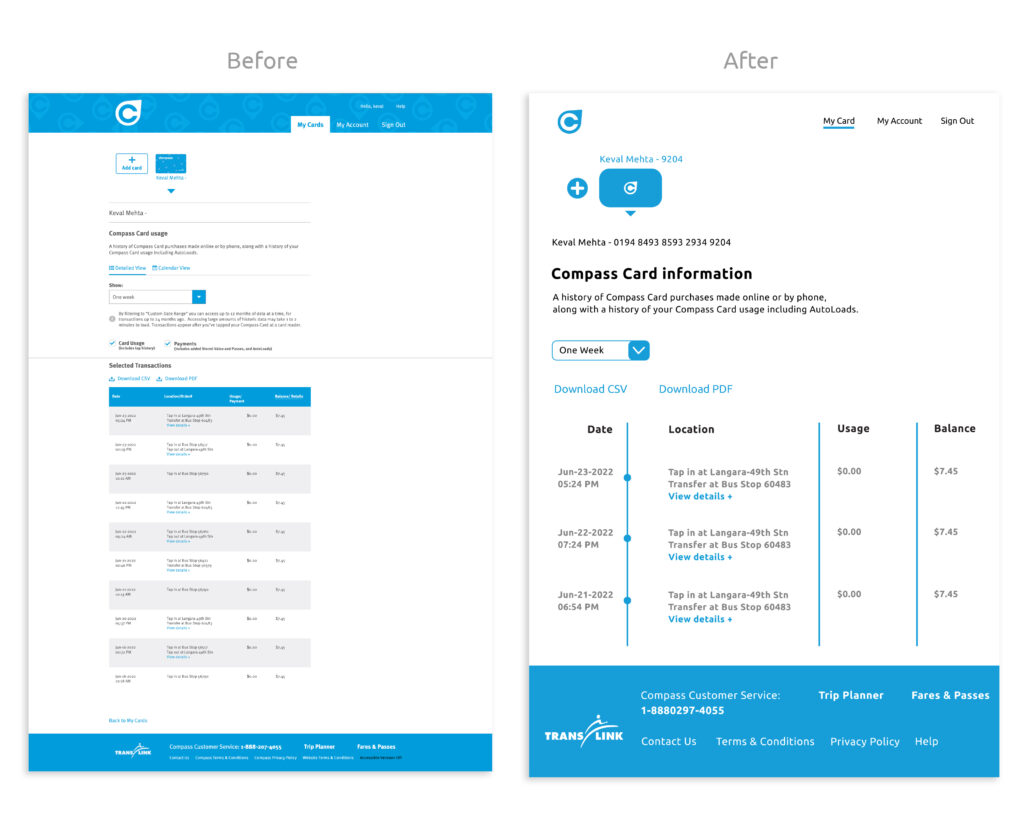
Problem
The existing page uses a tabular way to show the usage of cards which is not visually appealing.
Solution
The new design uses a timeline to showcase the usage which is easier to understand and the design is more coherent and concise compared to the table form.
The new website features a clean and modern design that is easy to navigate. The information is organized in a logical and intuitive manner, allowing users to quickly find what they are looking for.
The end result of the redesign was a website that is modern, user-friendly, and functional. The improvements have made it easier for customers to access information about the Compass Card and manage their accounts, improving their overall experience with the card.
Overall, the Compass Card website redesign was a successful project for me. I am proud of the end result and believe that it will have a positive impact on the customers who use it.