
Role
UI/UX Designer, Visual Designer
Team Size
1 Designer – 6 Developer
Skills
UX Research, Visual Design, Branding, Prototyping, Illustration, Motion Graphics, Video Editing
Duration
May – August 2022 (4 Months)
Software
Figma, Slack, Trello, Adobe Illustrator, Adobe Photoshop, Adobe After Effects, Adobe Premier Pro
Overview
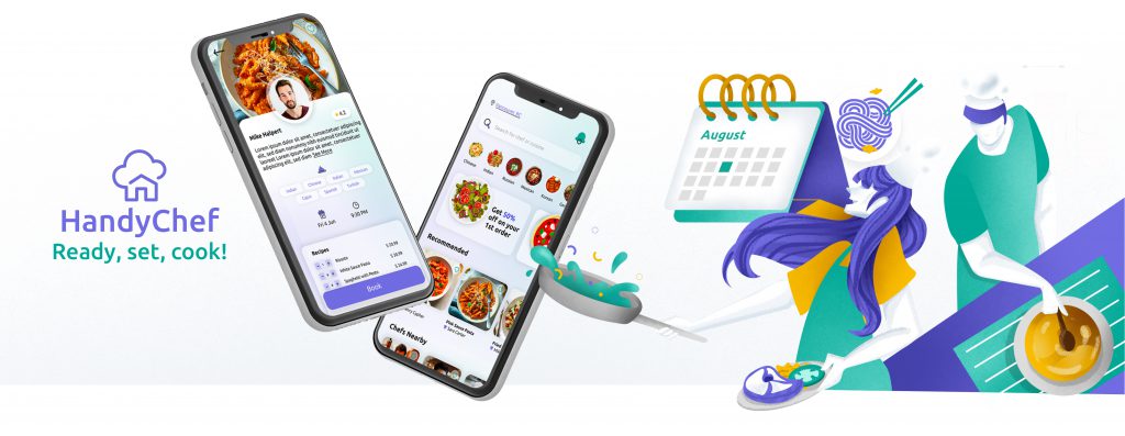
HandyChef is a cross-platform mobile app that connects independent chefs with clients to bring a private restaurant experience to the clients’ homes at an affordable rate. Both chefs and clients can have their tailored dining experience booked, managed, and reviewed from ingredients to a completed experience in a single application with a simple and secure payment procedure.
Checkout the team website here
Problem
The pandemic has significantly impacted the lives of chefs and those working in the food industry
People: Working people often face several problems related to food due to their busy schedules and limited time because of which they often resort to fast food or processed meals that are high in calories and low in nutrients.
Chef: According to the Canadian Center for Policy Alternatives (CCPA) Because of the pandemic, 180,000 workers left the food industry. This means that there are lots of potential chefs in the food industry without jobs.
Reference

User Research
While doing research I found some insights into the challenges and changes chefs have experienced:
Many chefs lost their jobs or had to temporarily shut down their businesses due to the pandemic-related closures of restaurants and catering businesses. Those who remained employed during the pandemic often had to work longer hours with reduced staff, leading to increased stress and burnout.
Chefs and other food industry workers faced significant stress and anxiety during the pandemic, resulting in increased rates of burnout, depression, and substance abuse.
User flow & Wireframes
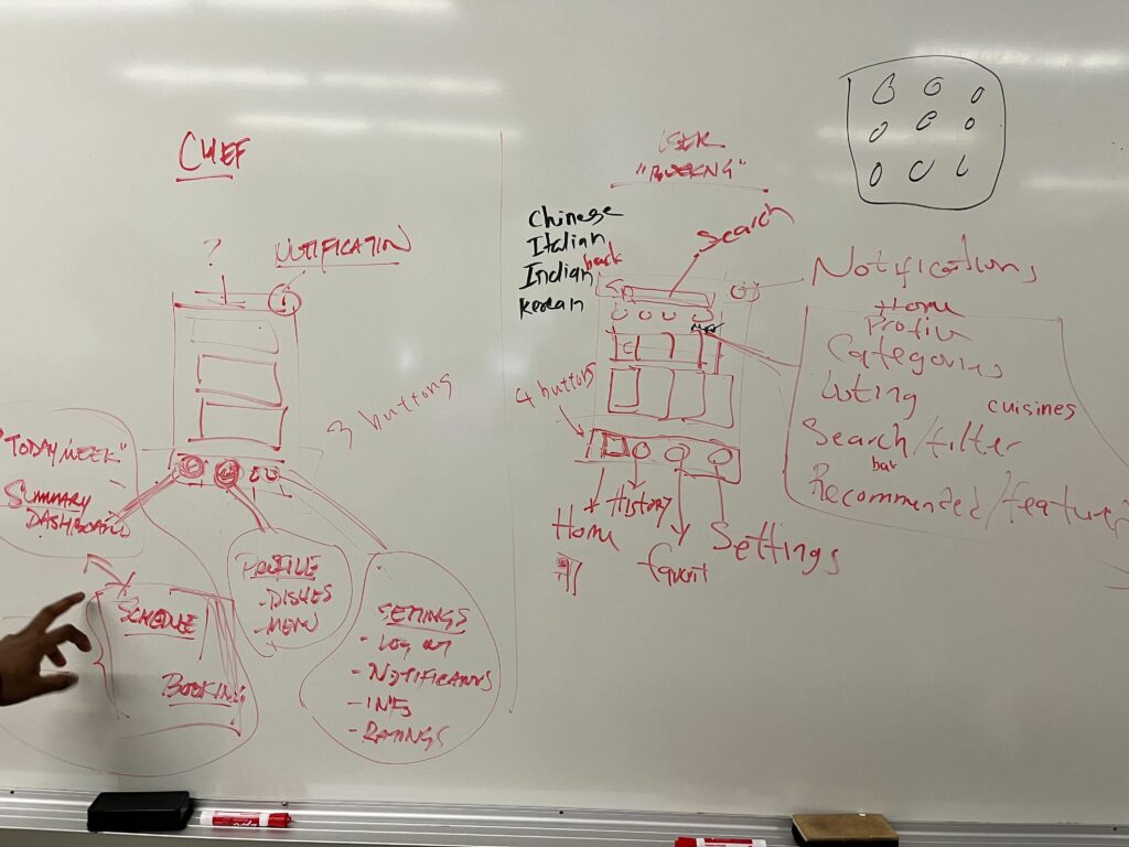
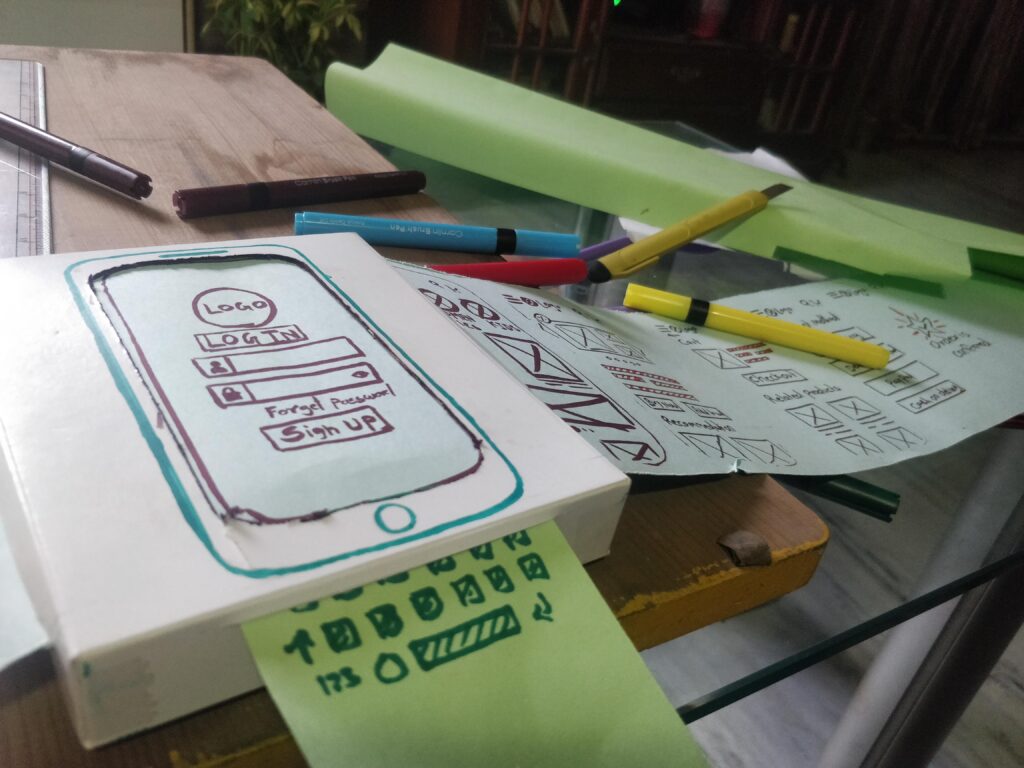
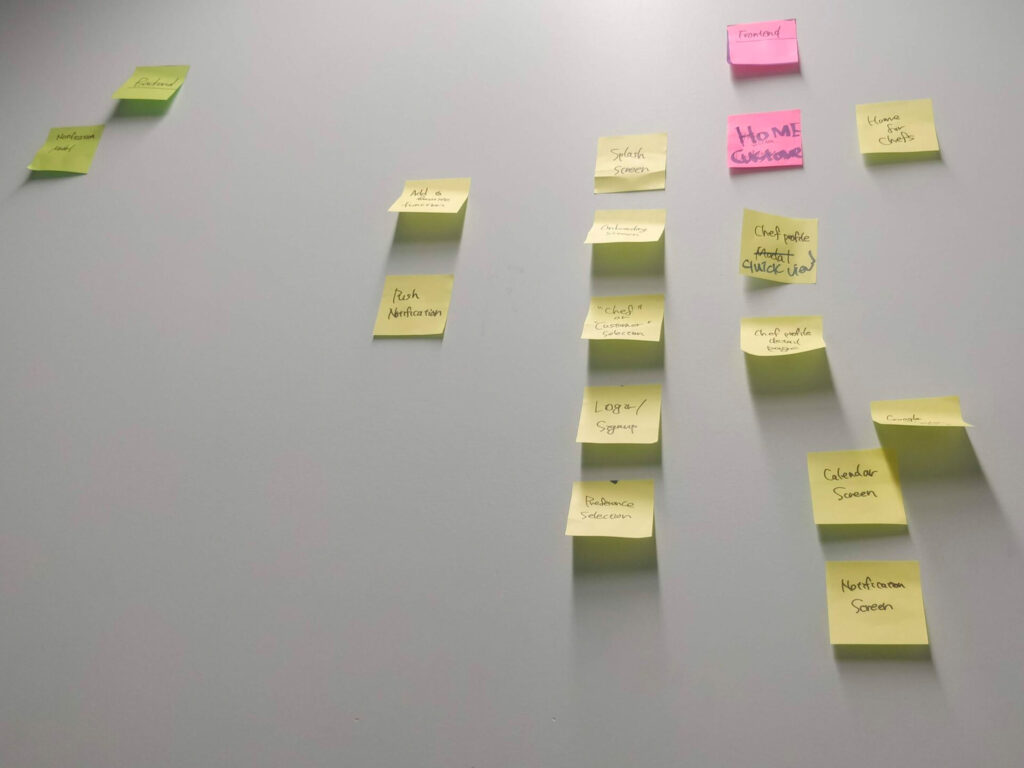
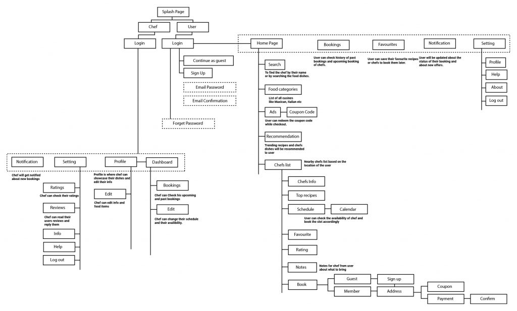
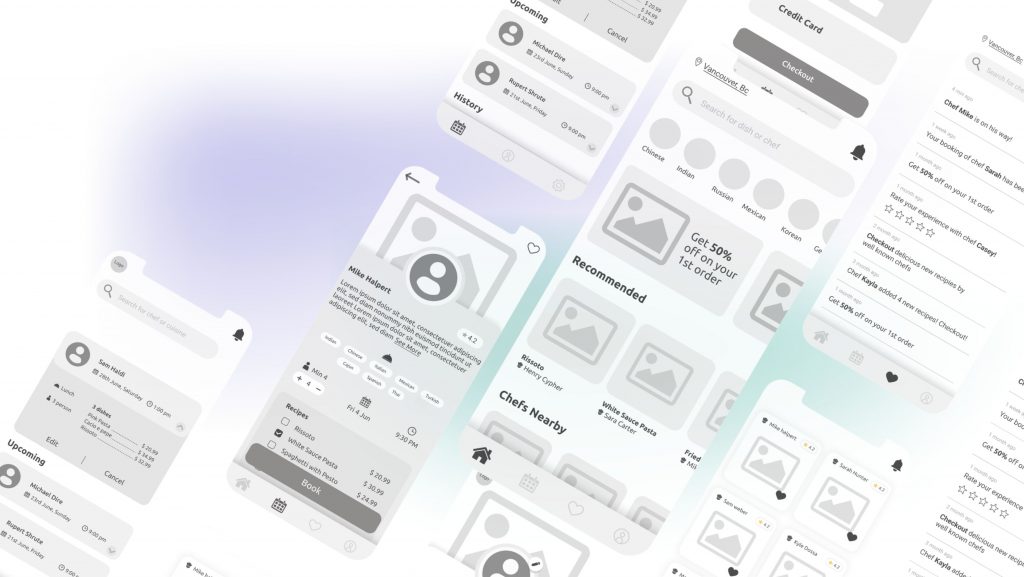
To start defining the interaction design and the information architecture of the app, I created a user flow that has both chef and customer sides. Then I mapped out the steps chefs and customers would take to perform various tasks within the app, such as creating and editing recipes, Booking the chef, or confirming orders. Once discussed with my team and later altered a few changes, I created wireframes for both audiences.


Icons
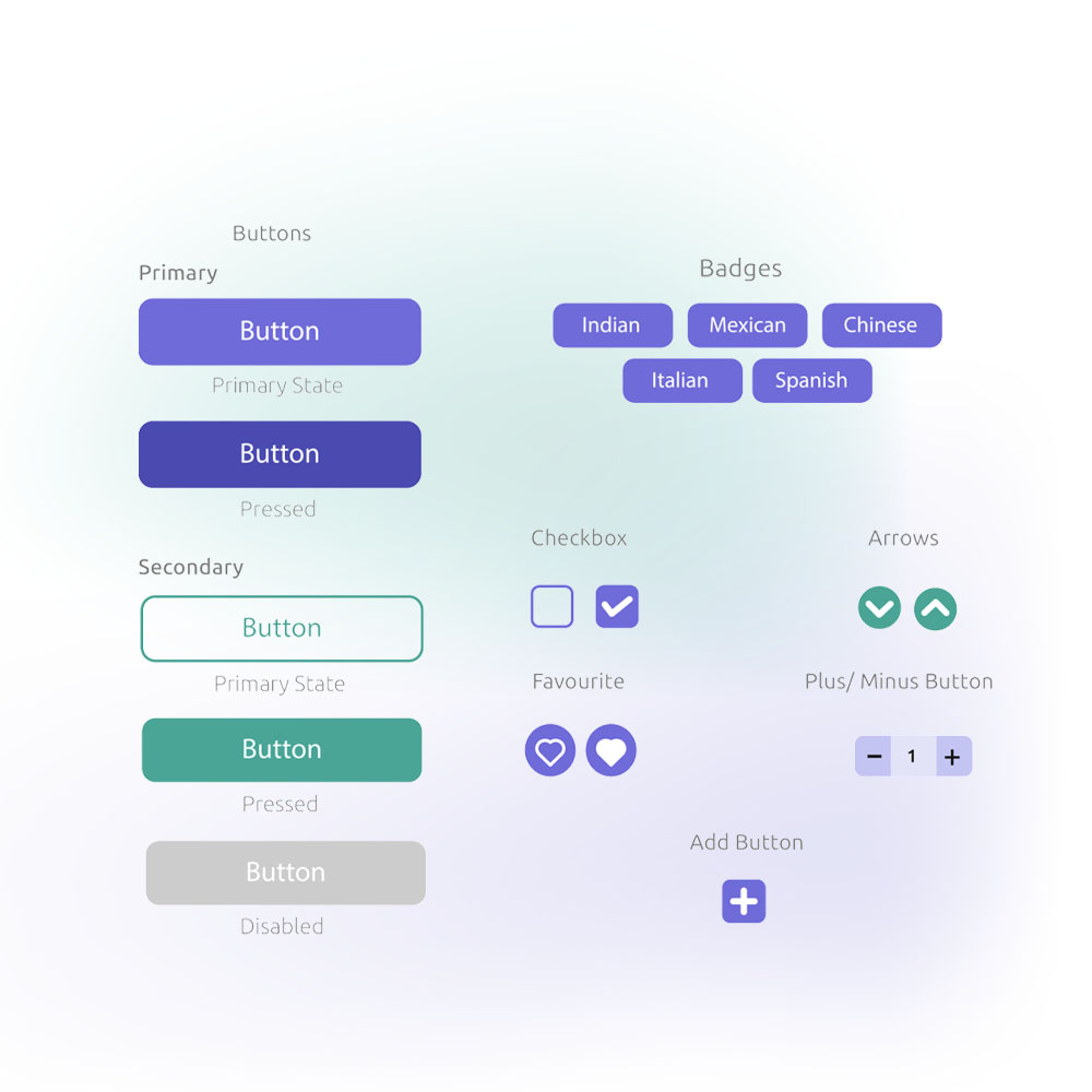
Meticulously crafted with a keen eye towards aligning with the app’s overarching aesthetic, the icons are thoughtfully designed to seamlessly integrate with the app’s visual language. Their cohesive presentation maintains an unwavering fidelity to the overarching theme, ensuring a sense of continuity and harmony throughout the interface. To imbue an extra layer of interactivity and a touch of whimsy, subtle animations have been artfully incorporated, enhancing the user experience by infusing an engaging and playful dynamic.


Logo
For the Handychef logo, the aim was to encapsulate a blend of key elements: the concept of a home, and a culinary connection, all while maintaining stylistic coherence with our existing icon set characterized by sleek strokes and rounded contours. From the outset, a resounding directive was to ensure the logo exudes minimalism and swiftly communicates the app’s essence.
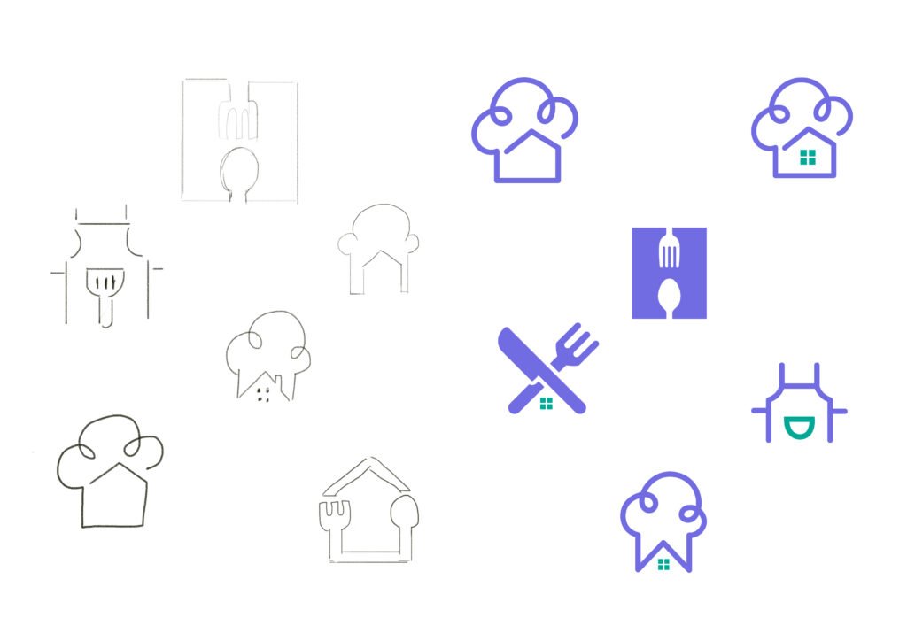
After iterating through several conceptual sketches aligned with the initial brief, we ultimately arrived at the logo presented here—a decision met with resounding acclaim for its harmonious embodiment of our vision.”

Solution
For customers to have private chefs at home at an affordable rate & For chefs to experience working as a private chef.
All of the existing private chef services aim at the high-end market. We aim to reach customers with lower budgets, and chefs who don’t consider themselves as high-end.
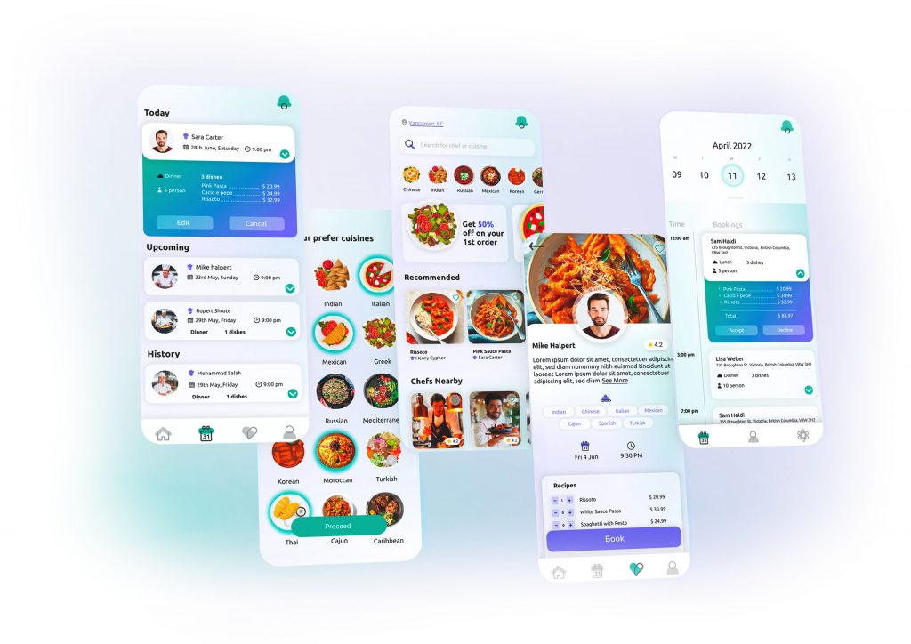
Mockups
High-fidelity Mockups
Check out all mockups here

The website now includes a comprehensive list of personal chefs and allows users to filter by location, cuisine, and availability. This feature has improved the overall user experience and made it easier for users to discover and hire the right personal chef for their needs.
Designing and developing Handychef from scratch in 12 weeks would not be possible without these incredible developers: Hiroshi Isobe, Minte Temple, Anastasia Snegur, Jacob Kim, Simer Singh and Nguyen Bui!
